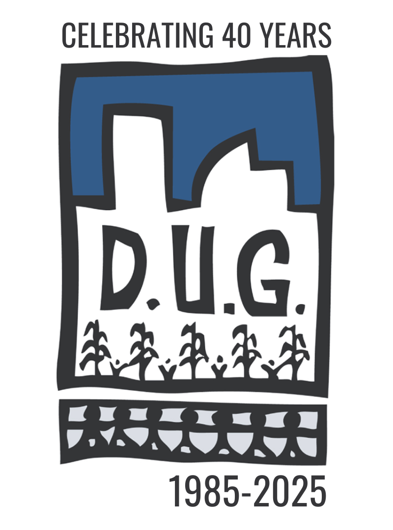
In honor of DUG’s 40th anniversary in 2025, we’re going back to our “vintage” logo from our beginnings.
This year, we’re welcoming back our founding logo with a little twist in commemoration of DUG’s 40 years in metro Denver.
…but do you know the logo’s background or meaning?
The original DUG logo was designed by DUG’s former Executive Director, Michael Bucheneau, when we became a nonprofit 501(c)(3) in 1985. Its design unites our pillars of food (corn stalks + seedlings), community (people holding hands), and climate (Denver’s cityscape). Moreover, the hand-drawn style is a nod to our grassroots origins when DUG community gardens were started in the 1970s by Hmong women in north Denver.
This year’s reiteration of our logo features our original color (hex code #335b89) which represents the connection and individuality present in each and every one of our community gardens and food forests.
Our logo is only one way we show our commitment to our community! Since the beginning, we’ve prioritized access to growing fresh + healthy food for Denverites – and we’ll continue to do so.


